


Posted on: Thursday November 21, 2013
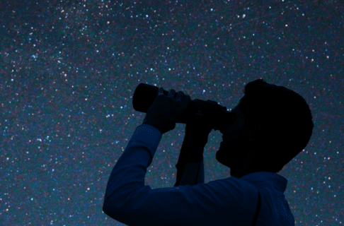
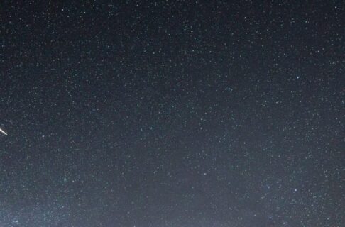
Over the past week we have had dozens of reports of green fireballs over Manitoba. Here’s the typical description: A flaming object, greenish in colour, flashing into existence and flying in a straight line towards the horizon. Perhaps it explodes; perhaps it heads behind some trees or buildings and disappears. It’s usually visible for only a few seconds, leaving many viewers wondering if they even saw it or imagined it. It usually looks like it is very close overhead, or came to earth just behind the trees nearby.
These are well-known objects, although we seem to be getting a lot of them lately. Called bolides, they are basically large versions of meteors (which are commonly called “shooting stars” or “falling stars”). They are dying gasp of a small piece of rock that has been in space since before the Earth itself was formed.
Back in the day, about 4.6 billion years ago, the solar system itself was just forming from a slowly-spinning disk of gas and dust. Most of the materials went to form the Sun; most of the rest formed the planets. All that was left were tiny pieces of dust and rock, scattered throughout the solar system, orbiting the sun in oval-shaped orbits that carried them across the solar system. Eventually, they crash into a planet, like the Earth as an example.
When a piece of this cosmic dust crashes into earth, there is no danger to us – Earth is significantly larger than a piece of dust, and so we win this particular collision. The dust hits our atmosphere at orbital speeds, without the benefit of the heat shields we put on our returning spacecraft. The friction with the air heats the dust and surrounding air so quickly that the air itself glows in a long trail which marks the dust’s demise. Many kilometers below, we can see the streak of light as a meteor. This happens all the time – if you go outside on a dark, moonless night away from city lights, on average you will see a half-dozen meteors per hour. If the piece of material is bigger – say the size of a grapefruit – it makes a much bigger flash. It may survive long enough to get to the deeper layers of our atmosphere, where it explodes in a bright flash. These are much rarer – you are lucky to see one or two of these in your lifetime, since larger pieces of rock in space are (thankfully) much rarer than dust-sized specks.
Every so often, a comet can go by and leave a big trail of dust in the Earth’s path – a cosmic dustbunny in space. When the Earth goes through this cloud of cometary dust, we can get a lot of meteors in a short period of time – a meteor shower. Meteor showers usually produce a few meteors per hour, with the more active ones producing a few dozen per hour – much more than the average, but still the sort of thing you have to be looking for to see.
It so happens that right now, we are just coming off of the annual Leonid meteor shower – a relatively weak shower that can produce a dozen or so meteors an hour in most years. This is the source of many of the meteors seen over the last week – the bright green fireballs are larger pieces of the cometary dust that Earth encounters at this time of year.
Alas, none of these fireballs are likely to survive all the way down to the ground to become meteorites – cometary materials are made mostly of ice, and so the heat of their passage through the atmosphere completely vaporizes them.